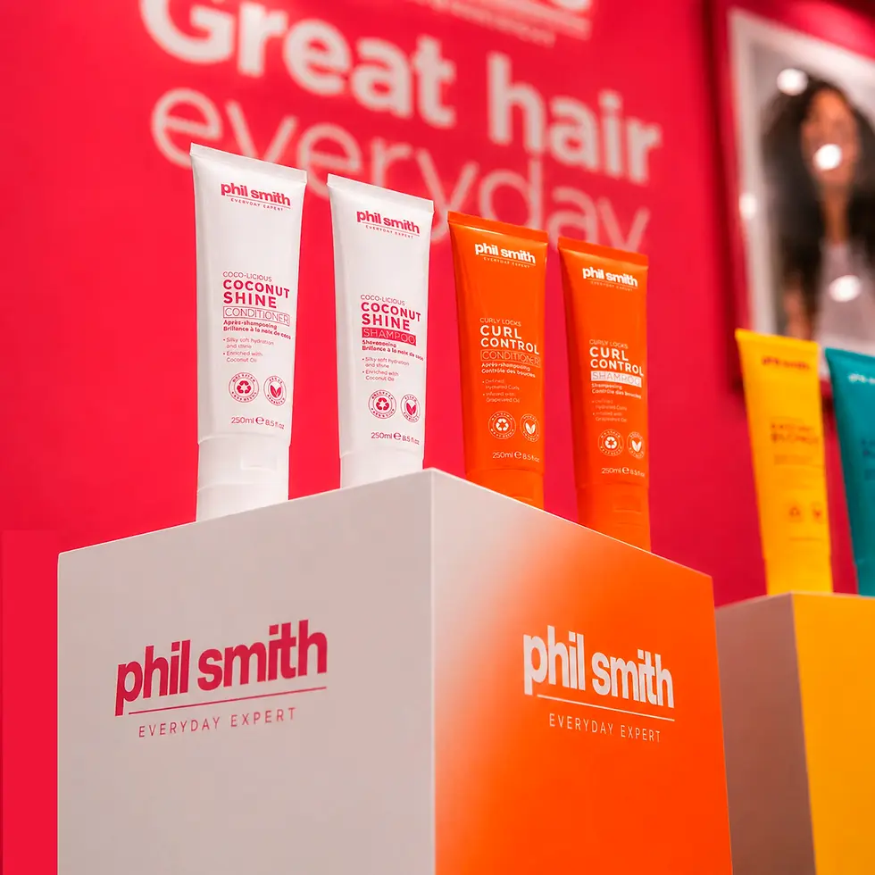
A bold new look for everyday haircare
From packaging and production artwork to campaign assets and retail materials, D16 created a vibrant, easy-to-navigate range designed to stand out on shelf and stay consistent everywhere else.
The challenge was to give a broad collection of products clarity without losing impact. A strong colour system helped shoppers quickly recognise each range, while confident typography and repeatable layouts created a clear family look across every format, from the smallest label to larger in-store and promotional graphics.
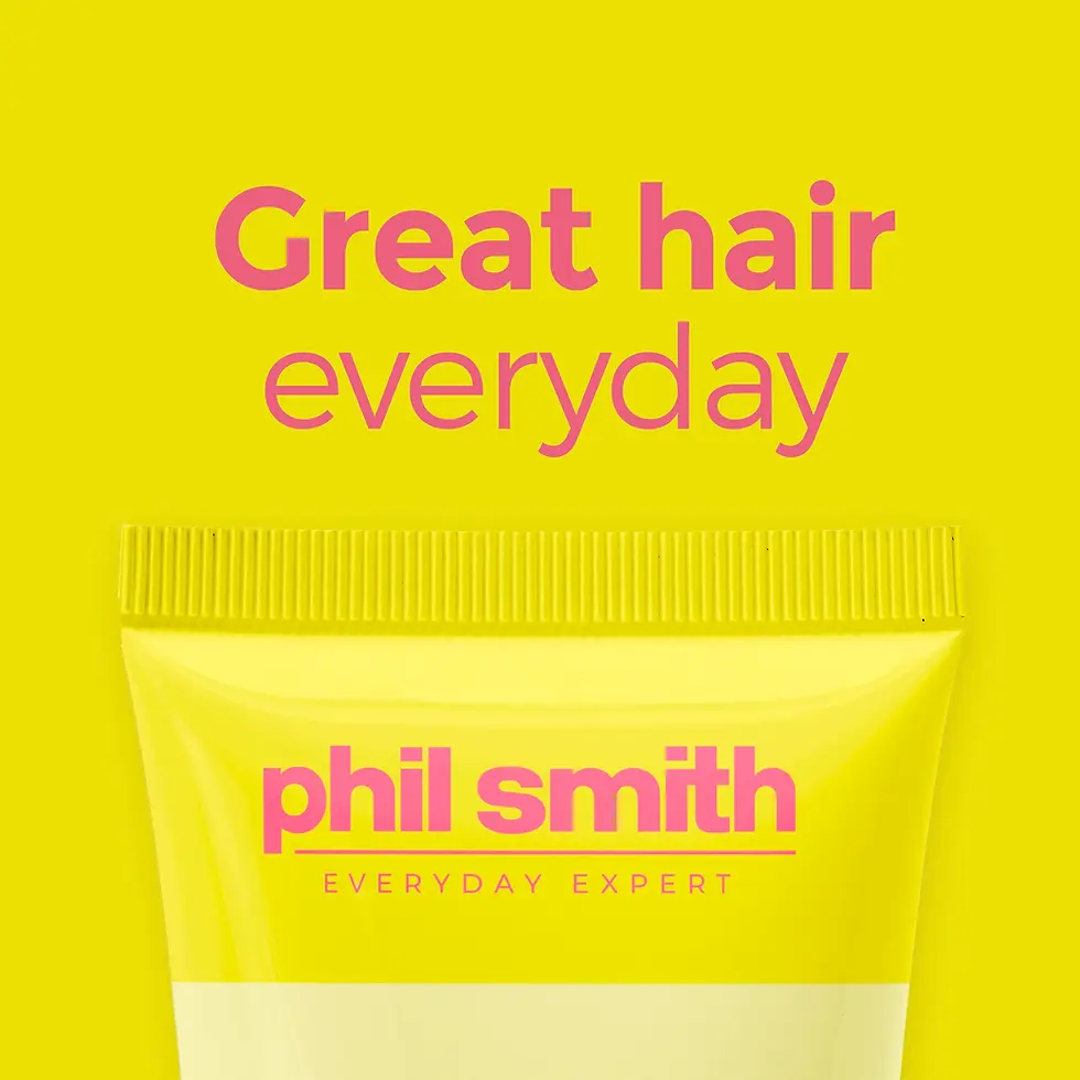




Clear benefits, placed front & centre
The packaging used a simple set of icons to communicate the range’s key product credentials at a glance. Recycled packaging, cruelty-free formulas and vegan-friendly products were brought together in one consistent visual style, giving shoppers clear information without disrupting the bold front-of-pack design.